For the first brief, we were assigned in this module we were tasked of appropriating a piece of existing media imagery and transform it in some fashion so it holds a new meaning or a new intention.
The Oxford Dictionary defines appropriation as “The deliberate reworking of images and styles from earlier, well-known works of art” – Oxford Dictionary
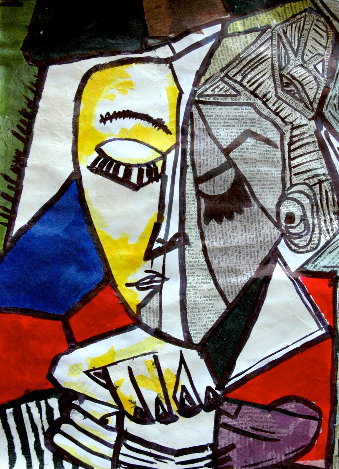
This art movement can be traced back as far as to 1912 to the cubism art movement with Picasso and Georges Braques with them using pre-existing materials such has newspapers to represented themselves as seen below.
In our appropriation lecture, we were introduced to probably the most infamous appropriation photographer Richard Prince. For a little background on Richard Prince, he was the first man to have a photograph sold for over one million dollars with “his” photo Untitled Cowboy. Now I put his in a quotation for a reason has he did not create the original image but rather he cropped it to so that the focus of the observer is changed to the cowboy then rather the product itself. The original image was, in fact, an advert for Marlboro cigarettes to attract more male consumers by using cowboy imagery to communicate the idea of “you can be like this cowboy if you buy our cigarettes cause he smoking them” with the original photographer being one Sam Abell. In the original incarnation of the image, the cowboy was merely just to be iconography for masculinity for the sake of profit but by cropping the image and removing the advertising it becomes a piece art of a lone cowboy roaming freely a symbol of the American west and the American ideal of manifest destiny or as Richard Dorment wrote in his article on the subject “it is about how the advertising industry has hijacked an American myth (the cowboy legend created by the dime novel and Hollywood) to sell cigarettes.”

When looking at this method from this perspective I can understand why this idea may be appealing to some has its a statement of taking back the photo as a piece of art and not some piece of advertisement meant to sell cigarettes like the Picasso example above. However, while the Picasso method of appropriation requires extensive modification using other materials such as paint to create a new meaning, a method that requires some artistic skill and a certain vision while Prince just simply cropped the image to remove the Marlboro logo which can be done in a minute in Photoshop. My perspective on this piece is that the overall message that it is trying to portray doesn’t save itself from the lazy execution has no real skill has gone into this retelling of the image to contextualise it. After researching this idea really inspired me to see past the advertisement and see the image behind it so I would focus on trying to find an advertisement and try to rework it for a new meaning.
While looking for another famous appropriation artist to gain inspiration I came across Sherrie Levine who was included in a group of other artists including the previously mentioned Richard Prince, and Cindy Sherman who were dubbed the “picture” generation.
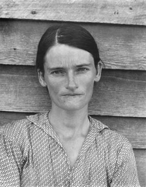
In 1979 in Sherrie Levine rephotographed Walker Evans’ photographs from the exhibition catalogue “First and Last.” The original photographer Walker Evans took the picture of Allie Mae Burroughs who later became a symbol of the great depression in 1936 to see the effects of the poverty that the three families he was staying with at this time. This photo provided a direct contradiction from the grim reality the general populace was facing to the calm, stern almost stoic demeanour that suggests a certain strength. Levine’s appropriation of these photographs was praised as an important landmark in postmodernism
While Richard Prince, who rephotographs advertising imagery change the viewer’s gaze to focus on the different element that is present in everyday visual culture in order to remove corporate interest for profit and let the art behind it shine, while Levine’s goal was to reflect the mechanism of the art system as a whole focusing on the elements of authorship and originality and then challenge those aspects in the form of rephotographing them in a different era to see how the meaning change. While reflecting on her work I don’t think the meaning is as clear as it was in Prince’s work of appropriation but it more of challenge the borders of ownership and the ideas of if a picture is taken in a similar location does it make it the same? This idea came up in a seminar on appropriation while we were discussing our individual projects and the example we came up with is the Lincoln Cathedral and the number of people who take the low angle photo of the front of the building. We discussed the idea of the first person to take a photo in that position of the subject being the original artist while the other without knowing it appropriating them. My view on this idea is that this appropriation on a daily scale however what makes them different and unique can vary on many different factors such has the technology, intent of the image or even who the one taking the photograph and the subject itself. Although this two weren’t directly linked I can draw a parallel between these two and will try to take these elements into my own piece of appropriation.
The third appropriation artist I looked into was Richard Pettibone who appropriate Andy Warhol’s famous Soup Can picture by reproducing them on a smaller scale. He did this to invoke the same scale of the model train he loved has a child turning a piece of art into a format which he prefers forcing his own preference making the piece of art appeal to him more. Of course, Andy Warhol was not the only one who was appropriated as he did the same with other artists such has Jasper Johns, Frank Stella, Roy Lichtenstein, Marcel Duchamp, Piet Mondrian, and Constantin Brancusi. This was met with some controversy when he first displays these pieces but it also invokes the question of ownership and the nature of originality that still is debated to this day.
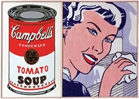
What I like about this piece is the irony of the usage of an artist who used existing materials such has Andy Warhol who appropriated the Campbells soup can. This idea of recycling the same images over again and applying different means through by something a small as it size really sum up the whole idea of appropriation has nothing more but retaking pre-existing images and just changing it slightly so that it has a new meaning but it still recognisable for what it was before. This cycle of copying copies seems to be the ideas of appropriation at its core.
For my image, I used a poster from 1992 for Nike’s “air huarache” trainers after researching the “Just Do It” slogan that Nike is now famous for. I was hoping to use some themes of mass corporate telling consumers what to buy for the sake of profit when I stumbled on this piece of advertisement. I found the wording of this advertisement very interesting has it is phrased in order to invoke a sense of treating yourself by having your feet hugged by the trainers, however, the phrasing reminded me of “have you hugged someone you cared about today” kind of saying. I decided to change the wording by crossing out the feet with a red mark and have the word “Mum” nest to it with an asterisk has if someone wrote on to the advertisement itself to tell someone to be more focused on relationships and not material good or self-pleasures like a mother writing on it to tell her son to hug her more than his trainers hug his feet. I really focused on this idea of people putting their own possessions over others time and time again by adding a grunge texture on the advertisement to give it the air of ageing has if it been left out or a long time with its message unheard.
The second image I decided to appropriate is a banner that is placed at the University of Lincoln’s campus for employment service that is run by the University’s support team. The reason I was drawn to it was because for me personally, I have seen these types of messages being repeated through my college years and now at university. The idea of these banners looming overhead always telling those below to be unique and individual adds a lot of pressure for young adults trying to find their place in the world and since I’ve seen them so much over the last 3-ish years they have become the polar opposite of what they telling me. They almost become visual white noise that I learn to tune out after seeing them 4 times a day since starting my course. This idea calls back to the Prince method of appropriation he used for the Marlboro advert, taking the orginal and cropping it so it focus on the words it self and then changed the whites and pink to purple to make it blended to the background.
These images can be seen here.
Bilbography
Dorment, R. (2008). Richard Prince: the coolest artist alive. Available: http://www.telegraph.co.uk/culture/art/3556477/Richard-Prince-the-coolest-artist-alive.html. Last accessed 16th Feb 2017.