For the second brief of this module, we were asked to creating three original images using pre-existing objects. These objects must not already belong to us and can be discovered on the street or countryside, borrowed or traded.
My inspiration for one of my photographs was inspired by a lyric from the song “Season 2 Episode 3” by Glass Animals which I’ve have been listening to a lot has of time of writing this.
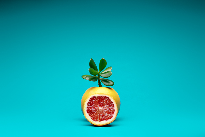
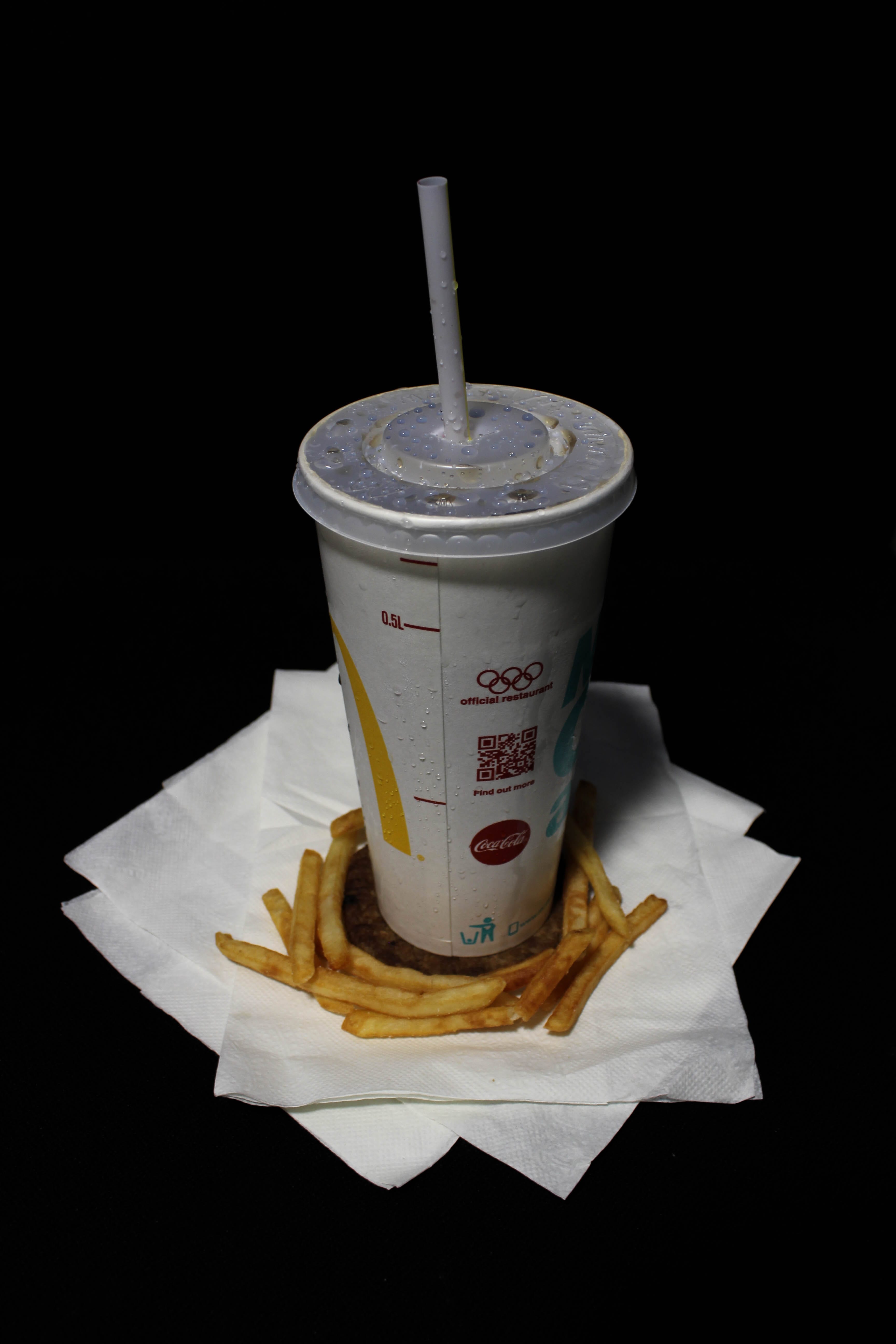
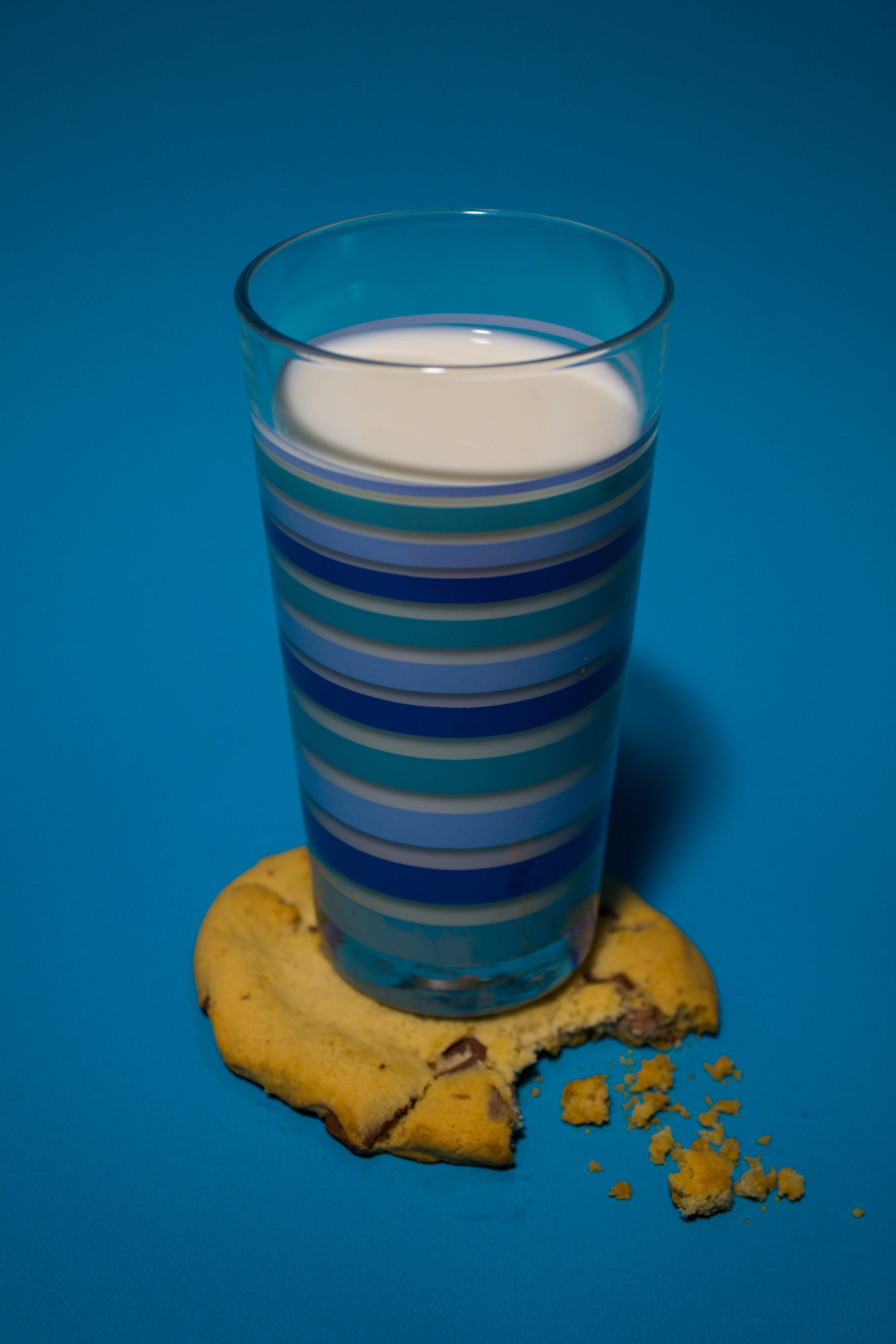
The lyric from the song is “With a cookie as a coaster” and this really stood out to me and provided a really clear image of these two objects which are commonly associated being rearranged in a different formation so that they have a different relation to each other, from one being to complement the other to acting as a functioning object such has a coaster. Using this as a starting point I wanted to revisualise different drinks the average person drinks and how the choices we are presented act a scale of health. I wanted to have two extremes at each side with a middle one being the point between the two extremes which will be the cookie and milk as one of them is good for the body while the other being sweet and unhealthy for you.
I start with this as a beginning point and researched for food photographers to help get some ideas together and I came across a photographer called Mark Lobo. I was inspired by his series of photographs called “Graze” especially his photo called “Frankenfruit”
What really stands out to me is the usage of bright colours that contrast against each other which gives them that colour pop without being a direct contrast. The background is very simple and it doesn’t take my focus away from the fruit, however, I do like the little shadow that is showing in the top corners as I think it gives the backdrop some dimension and gives it a nice colour gradient making it softer on the eye instead of being a solid background which could be harsher on the eye since the colour is quite bright and vivid. This little detail is present in the rest of the series which acts as a constant technical aspect making it more cohesive together since the subjects and colour tones take on different moods. I experimented with different colour backdrops and try to match them to different fruits and foods.
While I like this variation of colours, after showing the group they thought the different colour background separates them and makes it loses it cohesive together. One of the suggestions I got was to use a single colour backdrop to make them match each other better. I applied this to the glasses being used to give the impression of the same person’s perspective but with different choices in front of him.
Another found object photographer I researched into was Man Ray’s “Indestructible Object”.

What drawn me to this was the combination of the photo scrap of the eye on the metronome which adds a clashing element to the photo and gives it a surreal feel to the piece. It gives me the impression of someone gaze being constant and fixed on the viewer like a metronome keeping an even beat. According to Man Ray, “he linked his memory of her to the idea of an insistent beat or pulse that was both irksome and unending – a metaphor, perhaps, for human desire.”
I tried to incorporate this in the orange image with an origami coaster to resemble the stem of the orange along with a paper leaf on top. I wanted to invoke a childish tone with the orange as I see orange juice to be more appealing to children and it on the extreme side of health choices we are presented with in our life, however, I found it hard to apply this type of surrealism to my theme of balancing health choices and to the other two photos as the other two images have physical objects in the frame which doesn’t complement them.
The third inspiration I looked into was the photographer Slinkachu after it was shown to me by my photographer tutor.


I like the use of the figures being placed into the real world to create a new scene. His work is often compared to popular street artist Banksy has both works use the streets of London has their location however while Banksy works tend to be bold so that they draw attention to themselves and have a strong political or social commentary, Slinkachu’s goes for a subtle approach which is reflected in the use of using miniature figures, objects that would be glance over and don’t call attention to themselves. I find these works also have a stronger focus on the “Human Condition” a visual representation of how small we are in the world which is shown in the figure being placed next to insects like bees and sitting in gaps in the pavement has if it was a canyon. This type of photography fits the brief very well but I did find it hard to find these figures for the pictures, however, did take some photograph of a discarded cigarette packet.
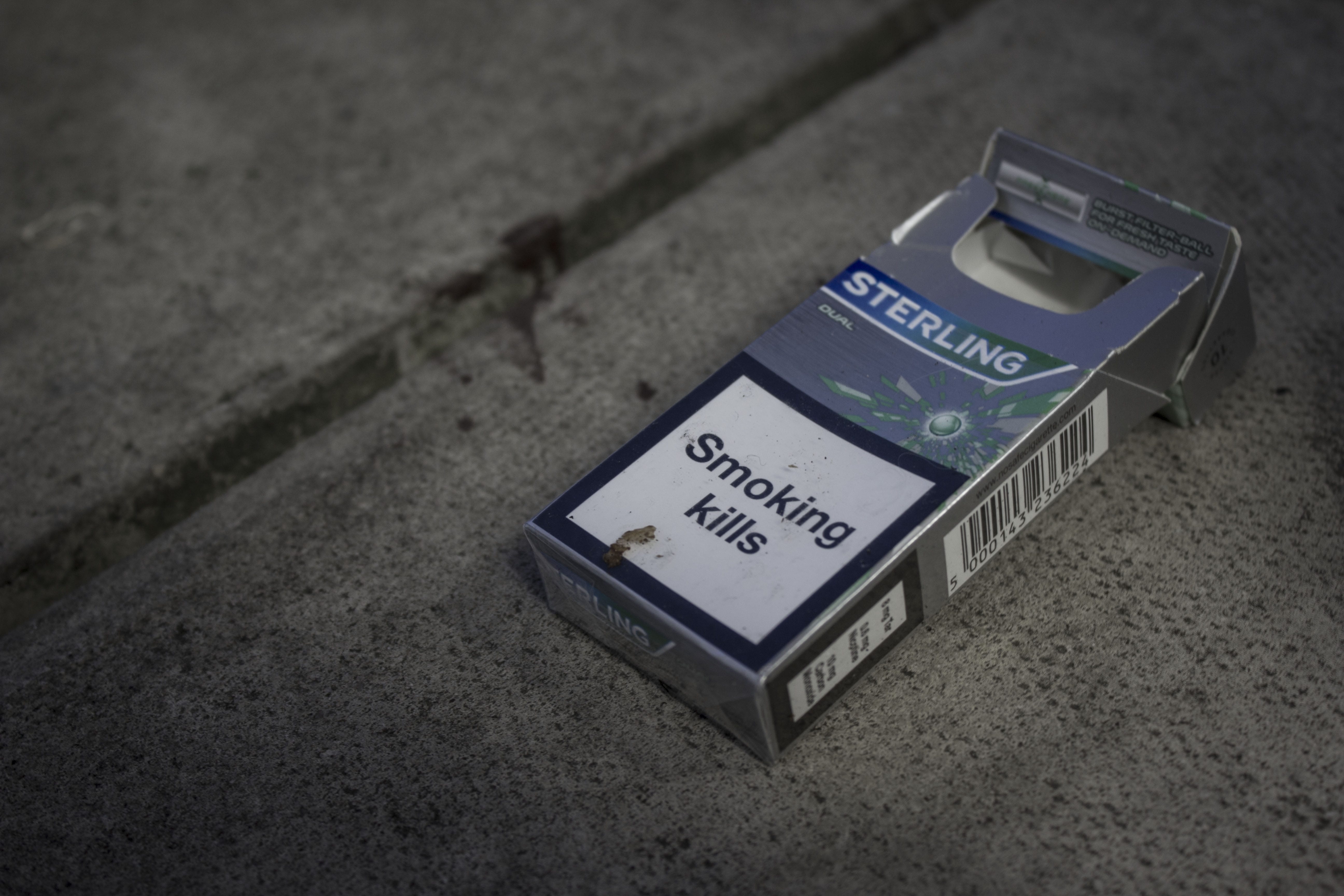
With this photograph, I tried to show the extreme of unhealthy life decision we make by having the cigarette packet being crumpled and discarded with no thought after it has been used. It shows how little we think about how we impact our health has we throw away something that tells us itself that it can kill you after we use it. While I like this theme I decided to discard it has other products that are usually thrown away like the cigarette packet don’t advertise their health risks on them so it would be as clear has for the message I was trying to say.
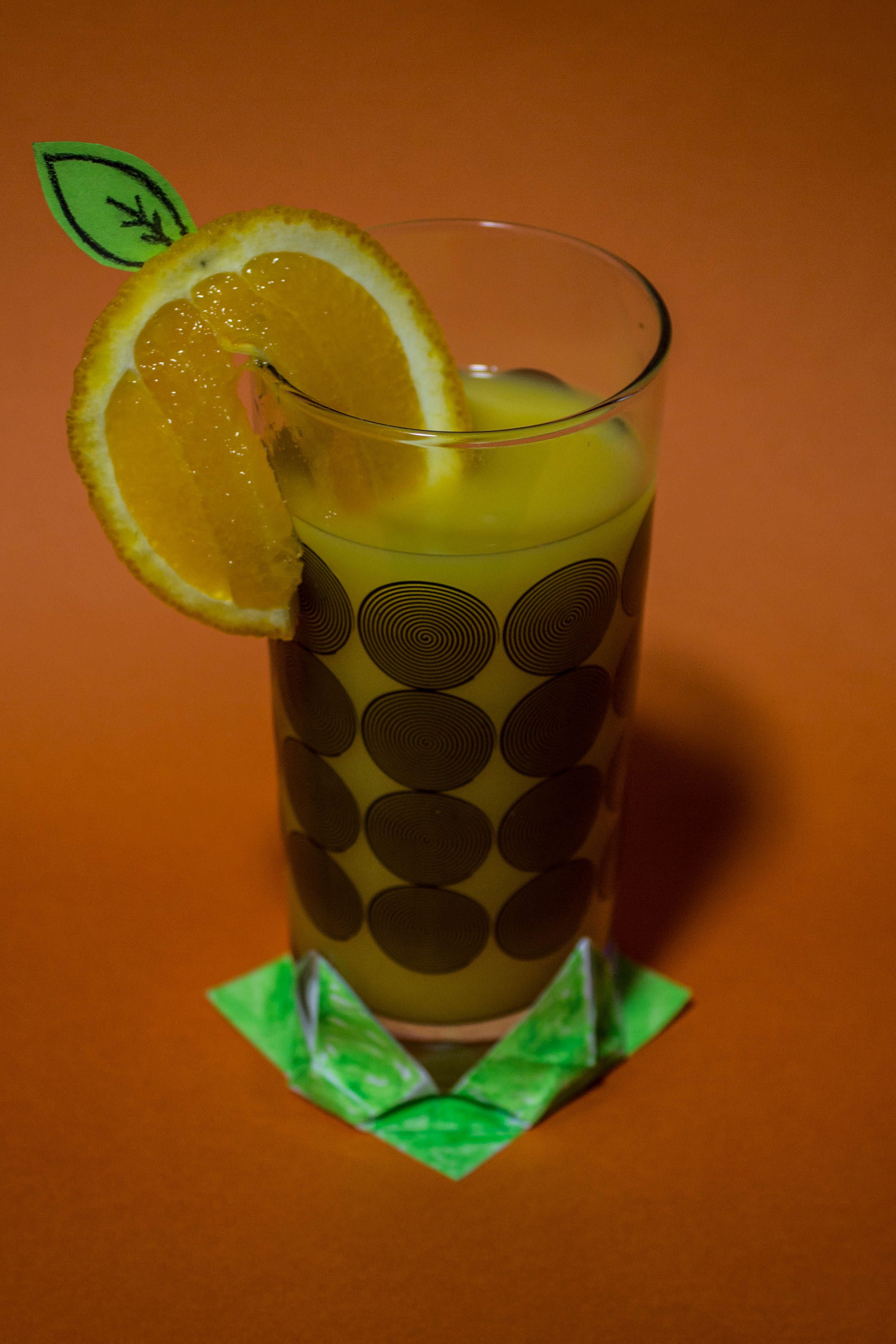
In my final images, I decided to use the same glass and have different liquids and foods to decorate the scene. I wanted to glass to represent a person’s body and the contents being what a person consumes in their day to day life. Along with the arrangement of them being identical and side by side I wanted to give the impression of being presented with a choice on what the viewer would pick, a life centred on health or a life of sweet unhealthy indulgence or settle for the comprise of a glass of milk a drink which is good for you and a cookie to add some sweetness. I wanted this simple arrangement of images to represent the constant choice of health we are faced with in a society obsessed with being the best version of themselves being the forefront of a person view in their decisions and have it boiled down to this simple choice of drink and snack and I think this refined setup achieves this.
The final images can be viewed here.
Bilbography
R, Man. (2004). Indestructible Object. Available: http://www.tate.org.uk/art/artworks/man-ray-indestructible-object-t07614. Last accessed 22/02/2017.
Leave a comment